Saturday, December 29, 2007

Sloggin'


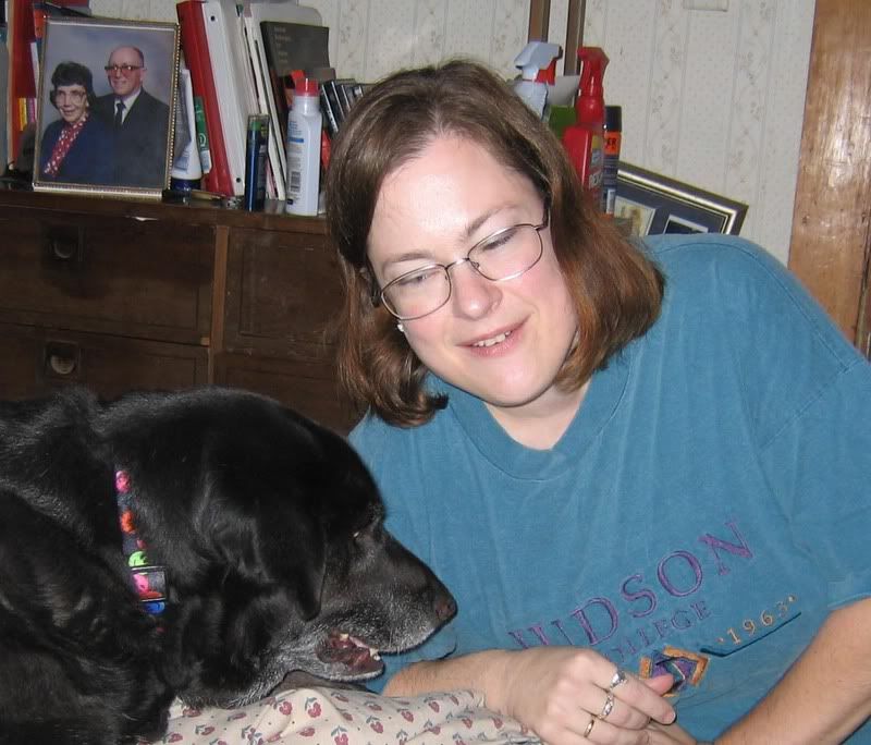
I have to admit I've been quite intimidated by the Daphne drawing. I guess it's because of several reasons. Realism is not my strength, for one thing. Another thing is that it has been a very long time since I have done any kind of a portrait (probably about 15 years). Finally, this dog it really important and special to me, and I want to do an excellent job. All of this, plus the inevitable holiday rush, has given me cause to stay away from my studio....until today. Finally I felt ready to add on to what I did last time, resigned to the fact that if I screwed it up too badly, I could always start again. Fortunately, it actually didn't go too badly. The problem is getting the right texture and color in the shiny parts of her fur. I have laid down a foundation in the middle of her forehead, but I think I will be experimenting with it for some time to come. Hopefully updates for this will be more frequent.


Additionally, I have started a new paisley. My mom challenged me to create a paisley in monotone. I chose a Stonehenge paper in cream and paired it with a Lyra pencil in sap green, which I think is a very attractive color combo. So far I have blocked out the basic shape and the fringy blobby things I like to put around it, but that's it. I'll probably post some photos early next week.

Thursday, December 20, 2007

New Project


I have had this project waiting in the wings while I finished my mom's paisley. I wanted to do a colored pencil portrait of our beloved dog, Daphne. This is a very special dog, a real comfort to our family (she's a natural therapy dog). I want her portrait to be really beautiful. The catch? I don't do much realism, and I also don't know much about doing layers like most colored pencil artists do (you may notice there were no layers in the paisley). So this is a double challenge for me. Above, you see the photo I am working on and the tracing I took to give me guidelines. I am creating on 8 1/2" X 11" white Stonehenge paper with Prismacolors. If you want to know how I did the tracing part of it, just drop me a message and I'll explain that.


My mom gave me good advice about how to approach the fur texture. I am simplifying it for myself somewhat because I don't have the patience to do a lot of layers all in one place. I can handle a few though. If you look below, you will see the part of the project I did tonight.

So Far


Here is the part of Daphne's fur I did tonight. That section is quite dark and in the photo does not show much texture; I chose to keep it dark, but to give more texture. Of course this will probably be modified later in the process. Basically it is black fur texture over blue slate (Daphne has a blue undertone to her fur). I know some people say you should never use black colored pencil, but instead should mix your black out of other colors. Well, I tried that on scratch paper with different color combos, and none of them looked like Daphne's fur as much as the black pencil does, so I'm going to try it this way. If I'm not happy with it, I'll probably do it again. I'm bound and determined to do this well (not perfectly, mind you, but well).

Monday, December 17, 2007

Finished!


This went a lot faster towards the end, for some reason. What a learning experience! I think the main thing I learned on this one was to keep my pencils really, really sharp unless I was laying down a large field of color, in which case multiple layers were needed. I also learned that I was frustrated by working with a limited set of colors....although I really like the way it works. Using the Tuscan Red for all the outlines brings some unity to a pretty chaotic image. So do the repeated themes such as gradients, natural elements (hair, fish scales, etc.), and curved lines.


I realize this creation has some serious limitations as far as composition goes, and that overall it is, like I said, pretty chaotic. But hey, so is life. I'm proud that it turned out as well as it did given my fairly primitive level of skill. And now it is ready to give to my mom for Christmas.
Oh, and in case you didn't know (I didn't until someone pointed it out to me) you can click on the picture to see it up close and personal-like.

Tuesday, December 11, 2007

Struggles


The worst part of this whole thing is the photography. I know there must be a way to capture the richness of the chromatic colors and the vibrancy of the metallics without glare and the garish overstatement of the contrast option of Photoshop Elements, but I have yet to find it (and not enough time to figure it out). I am sorry to bring you this photo of the paisley, which is admittedly lacking in detail and color-realism, but this is as good as it gets right now. The drawing itself is going fairly well. There are things I would like to change, of course, but overall it is progressing in a satisfactory manner. As you can see, the main paisley shape is done. Now I have to do the fringes, the round piece, and the blobbies on the end. I will stick with the same color selections and probably introduce a few new themes and patterns which will capture the contrast between the sharp, angular shapes and the rounded, curved ones.

Sunday, December 2, 2007

Close-ups of Paisley--See Below for Full One


Truckin' Along


I have not been doing much artistically this week because of illness, crazy weather, and general busy-ness, but I have been plugging along at my mom's paisley. I'm pleased with how it is coming together. One thing I learned is that in a work this size you have to either pick colors you have lots of, or pick lots of colors. Since I am doing this with eight colors, some of which they do not carry in open stock at the local stores, I went to Dick Blick and stocked up on the ones I needed: Chocolate, Tuscan Red, and Dark Green. The other colors I either have some extras of, or they carry at Hobby Lobby: Indigo Blue, Copenhagen Blue, Metallic Gold, Metallic Silver, Metallic Copper. I hope now I have enough to finish this puppy!